25/04/2012
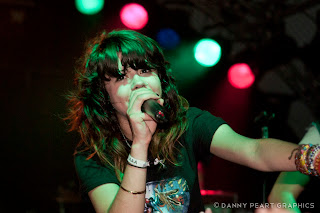
We Are The In Crowd - Leeds Cockpit 24/04/12
17/04/2012
Angels and Airwaves - Leeds Academy 12/04/12
The San Diego quartet, Angels and Airwaves hit Leeds Academy as part of their six date UK tour with their alternative rock and sci-fi light show with the intent to impress, and they did just that.
You can check out some of my photography from the show alongside a review from Leeds Academy over on Est.1987 here;
http://www.est1987.co.uk/2012/04/angels-airwaves-le-blorr-live-review.html
Le Blorr - Leeds Academy 12/04/12
04/04/2012
Yashin - York Fibbers 14/03/12
Back on the 14th March i went down to York Fibbers to take a few shots of an up and coming band called Yashin for a review. With no barrier in the venue i had to work my way through the crowd to get the shots which was difficult to say the least, but none the less i had a blast and i look forward to getting some more opportunities like this to get some live shots. It was quite an energetic gig and they are definitely a band to watch out for in the future.
You can check out the review over at Est.1987 through the link below;
http://www.est1987.co.uk/2012/03/yashin-live-review-york-fibbers.html
02/04/2012
Guitar Lighting Project
For my final project for my Photography NCFE course, i decided to take a shot of my guitar and add some creative lighting effects to it in Photoshop using multiple techniques and images. The idea came from creating a visual representation of music through the guitar using bright colours and movement.
York Night Photography
Having come to the end of my Photography course i have been taking over the past 13 weeks, i decided to get out and take some night photography of York experimenting with slow shutter speeds and capturing some night trails and colourful sky and cityscape images. Here are a few photos from my trips out into the night!
These City Walls Project
Another Local band i have enjoyed working with are These City Walls. Here are a few pieces of design work i have done with them for their logo, gig poster and i tunes single cover.
You can check them out over on facebook at; www.facebook.com/thesecitywalls
Likely Lads Project
One of my ongoing projects i have enjoyed undertaking was for a local York band called Likely Lad, who i have been working with for well over a year now. Here are a selection of recent gig posters and logo designs i have done for them in that time. You can check the band out here at; www.facebook.com/likelyladsband
January Snow Photography
In January i started my Level 1 NCFE Photography course for the following 13 weeks, and with the snow falling mid January i decided it would be a good opportunity to get some practice taking some photos with my DSLR camera of some of the trees and plants in the snow covered fields opposite my house. Here are a small selection of the photos i took that day.
Smart Car Advertising Project
My previous project for my graphic design degree was to create an advertising campaign for the Smart Car range, specifically to pull people into the York showroom at Clifton Moor to take one for a test drive. I decided to create a portrait, Landscape, and bus side posters, that all worked off each other in a series using bright colours and a detailed illustrative design, to represent the fun creative side of the Smart Cars the company like to portray to their target market. I also designed an e-mail design to expand ways of communications as today e-mails are a good way of contacting multiple people with offers and advertisements to get peoples attention in the specific target market.
A Quarter Of - Retro Poster Design Project
Back in January i did a project for my graphic design course to create a retro poster for the sweet shop A Quarter Of. I decided to mix up some hand drawn typography and re design the logo to create a strong bold message, alongside a set of pick n mix sweets in the poster to grab the target markets attention. I decided on a bright soft pastille like colour scheme for the final poster as i thought it represented the sweets well and would work effectively with the typography.
Kiss And Tell
Here's a quick fun piece of typography work i drew in Illustrator and Photoshop. It was based on some lyrics from a song by one of my favorite bands You Me At Six.
Coca-Cola Poster Design
Whilst developing my Photoshop and Illustrator skills i decided to create an illustrative poster design for Coca-Cola. Sticking with their original logo as a center point i decided to create a series swoosh marks to represent the flow of the drink and bubbles as a border pattern, with a drop shadow to give the poster a bit more depth. By sticking with the original Coca-Cola red colour scheme i was able to make a strong connection to the brand.
Subscribe to:
Comments (Atom)


